Skip to content

Minnesota 4-H Brand Refresh

VISUAL IDENTITY | CORPORATE MATERIALS + DESIGN TEMPLATES | ENVIRONMENTAL | SIGNAGE

Creating a distinctive state-level visual identity for a national heritage brand

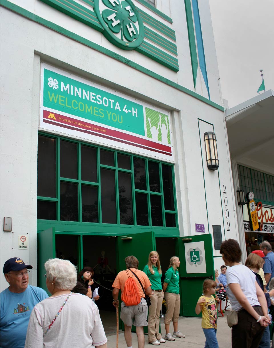
Minnesota 4-H, part of the national 4-H youth organization, is operated by University of Minnesota Extension. They provide a wide range of leadership and learning opportunities to over 66,ooo youth across the state. Focus areas are extremely diverse — including animal science, gardening, STEM, civic engagement and more.


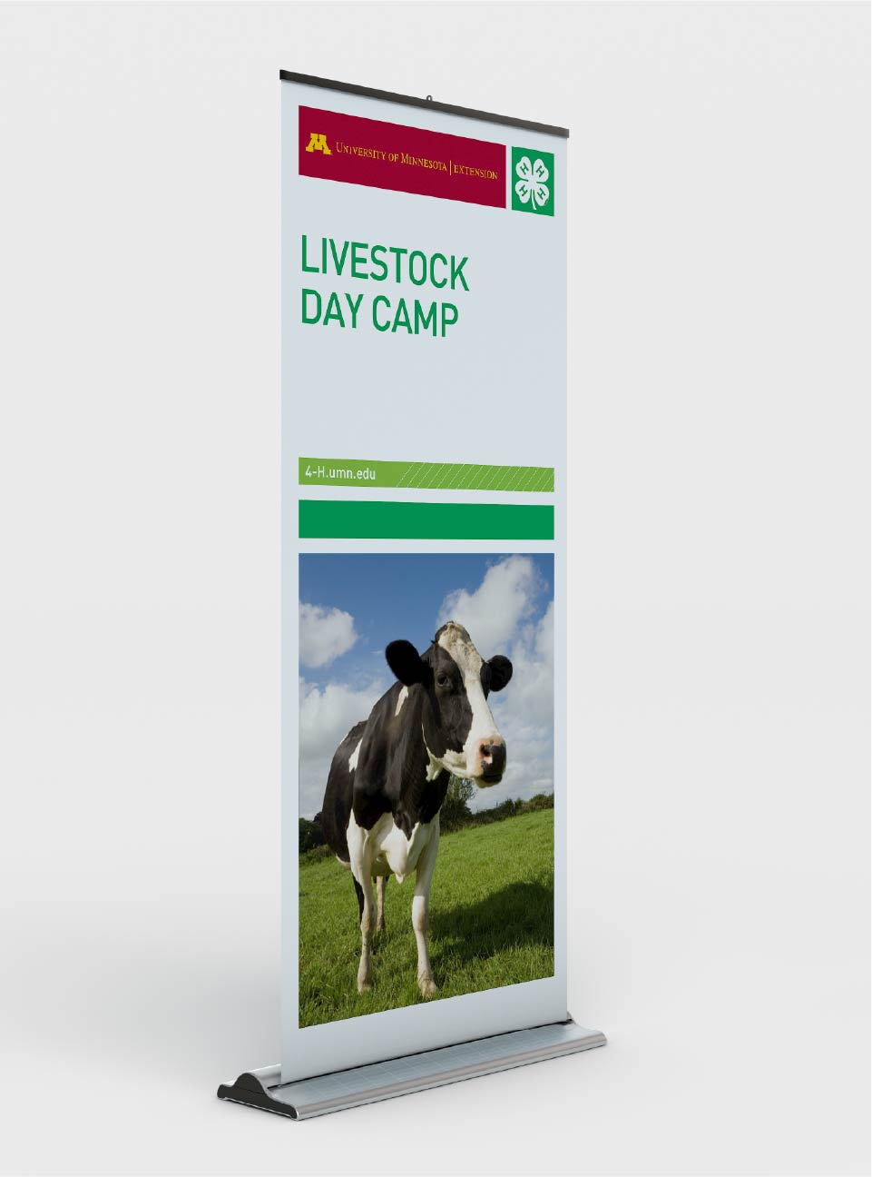
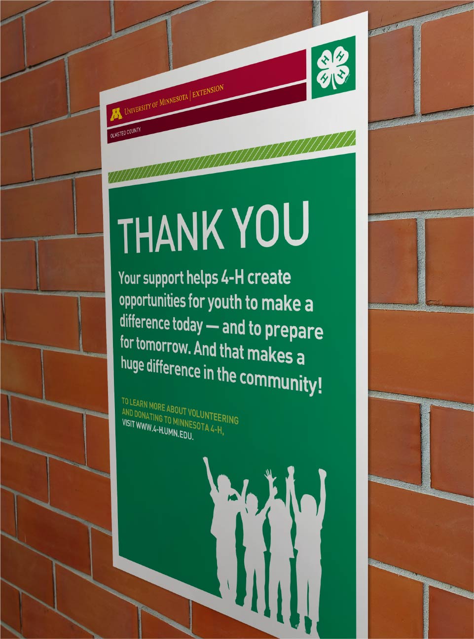
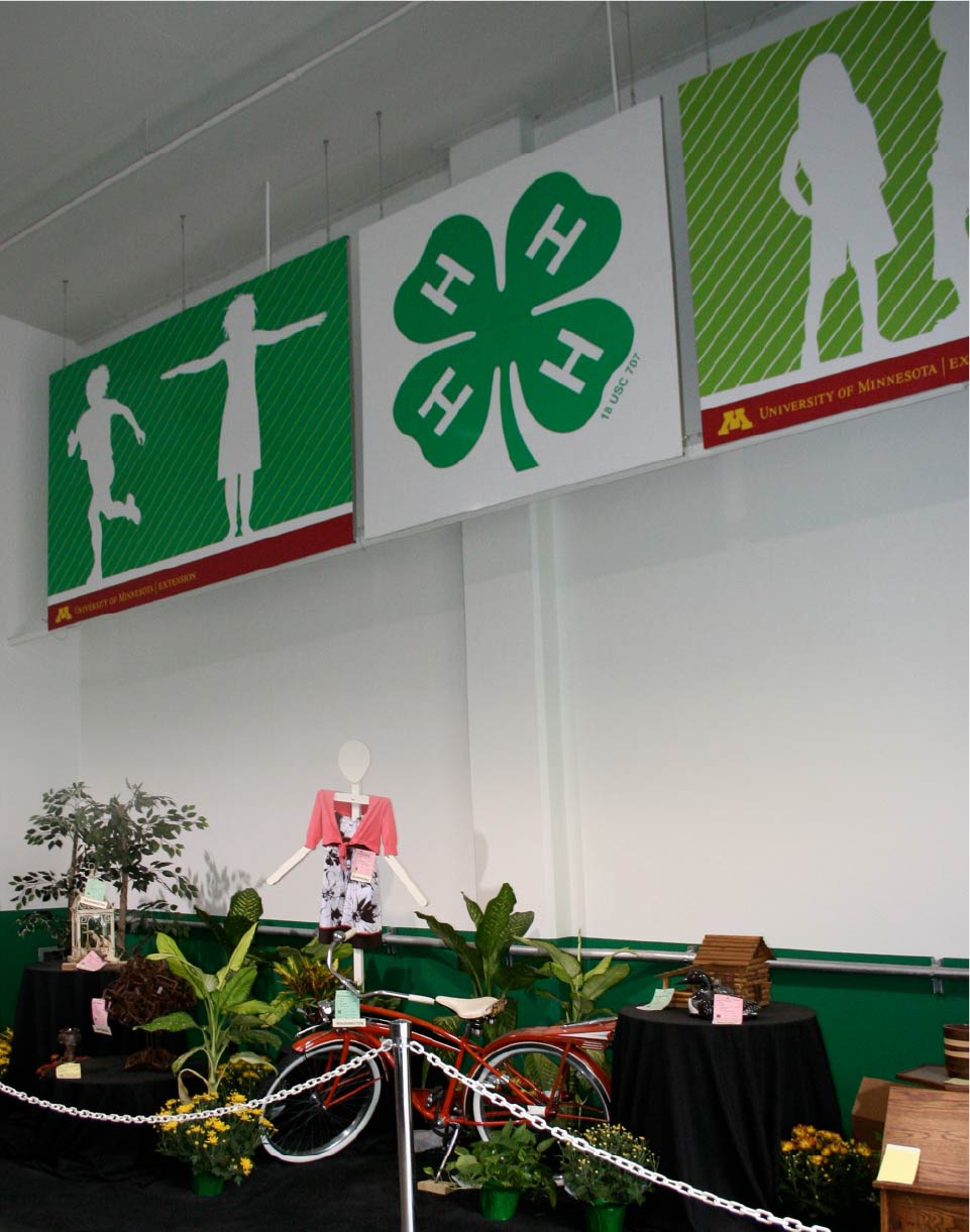
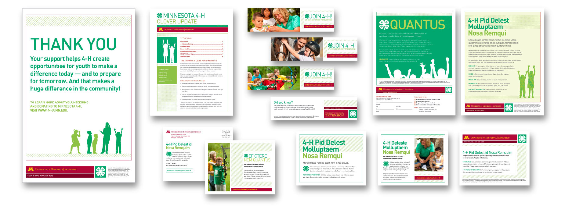
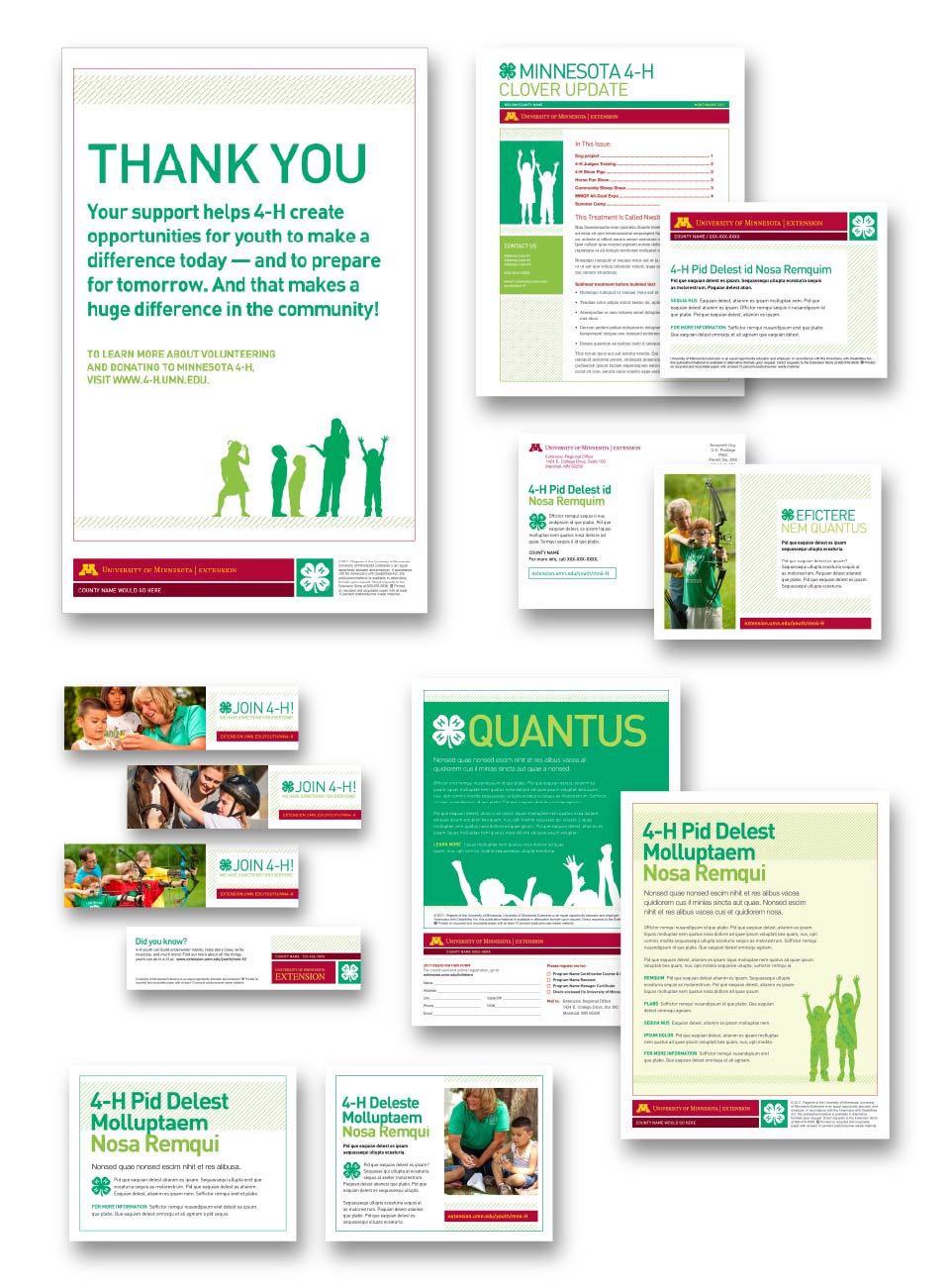
While their programming content was robust, Minnesota 4-H’s state and county-level branding lacked consistency and cohesiveness. Although program materials did consistently use the 4-H clover logo and signature green, they also used a wide range of fonts and accent colors. The use of poor quality “clip art” was also commonplace. To add to the challenge, most marketing and promotional materials were being created by staff with little to no formal design training and spread out across the state. All of these factors were contributing to a diluted, weakened brand.


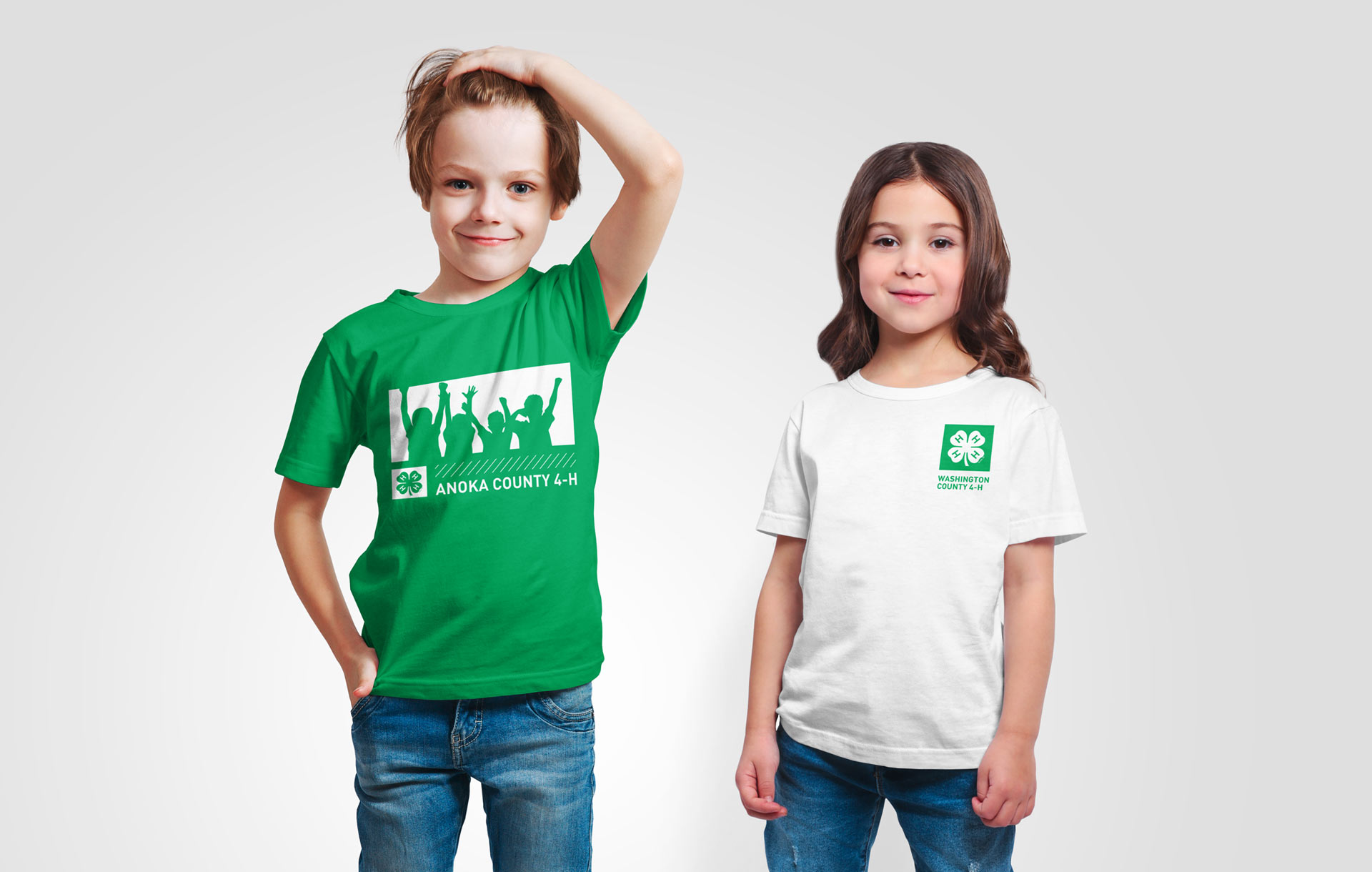
Looking to solve these brand challenges, University of Minnesota Extension included the Minnesota 4-H program within its larger, comprehensive brand initiative, and they selected DRIVE as their partner in this rebranding effort.

  1. Create a distinct visual identity system for Minnesota 4-H.

  2. Increase brand strength and recognition via improved consistency.

  3. Enhance visibility of University of Minnesota Extension as the 4-H state operating entity.

  • Create a unique visual identity that ladders up to the national brand while also incorporating elements of UMN Extension’s new visual identity. The lime green accent color, signature UMN Extension pattern, and expressive youth silhouettes combine to create a distinct, ownable look that — with consistent use — will build greater brand recognition for Minnesota 4-H over time.
  • Develop templates and resources to make it easy for staff to create high‐quality, on-brand marketing and promotional materials. Templates were provided for PowerPoint presentations, brochures, flyers, postcards, bookmarks, t-shirts, signage, etc. — all customizable with program- and/or county-specific content.
  • Provide brand guidelines to staff with instructions and examples of how to use the identity elements.
  • Create an online photo gallery providing staff with easy‐to‐access, high‐quality, professional photos adhering to the new photo guidelines.
  • All three goals were successfully met.
  • The new identity consistently leverages both the brand awareness of the national 4-H organization while underscoring UMN Extension’s role as the state operating partner.
  • Minnesota 4-H’s brand guidelines, visual assets and growing library of brand-right images and silhouette illustrations continue to empower staff and creative partners to express the Minnesota 4-H brand with both consistency and visual interest.
  • Consistent use of the professionally-designed templates and assets has enabled Minnesota 4-H to build greater brand recognition over time.

Refreshing the MN 4-H State Fair experience

The refreshed branding took center stage at the “great Minnesota get-together,” where 4-H youth showcase their skills and talents to the fair’s over  two million visitors.

Staff-friendly design templates

We created design templates for everything from brochures and flyers to bookmarks and postcards, enabling non-designer staff to easily create consistently branded materials across the state.