Skip to content

Mora Public Schools Rebrand

Strategy | messaging | VISUAL IDENTITY | CORPORATE MATERIALS + TEMPLATES | ENVIRONMENTAL BRANDING | PROMO MERCHANDISE

A school district makes the leap to a stronger, more ownable brand

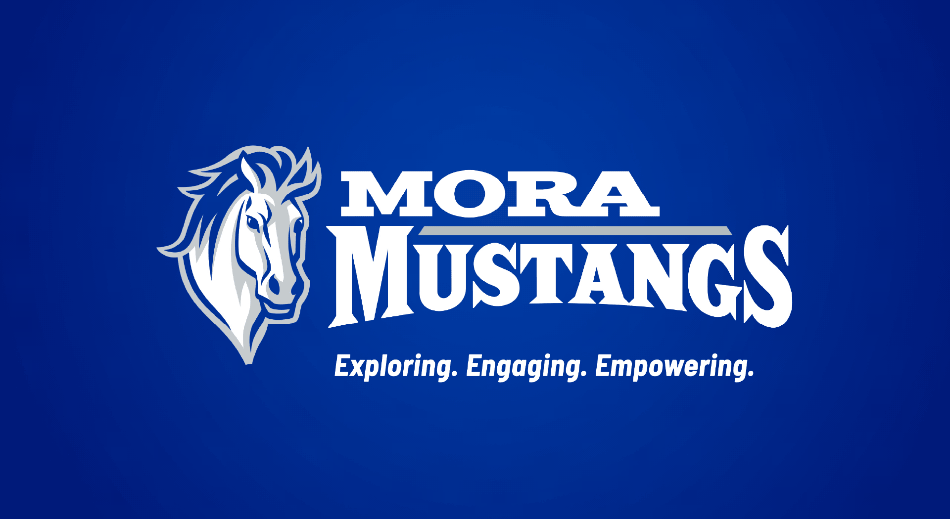
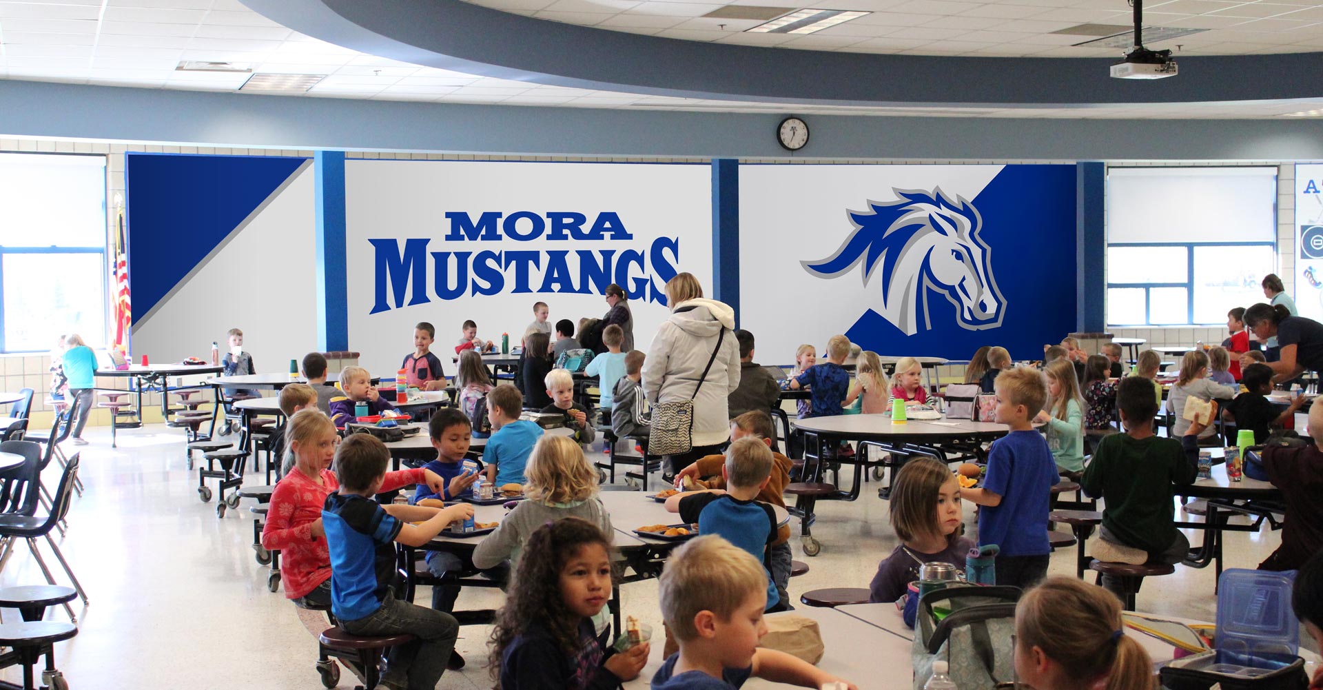
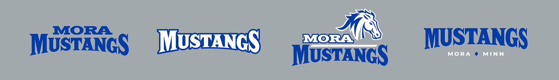
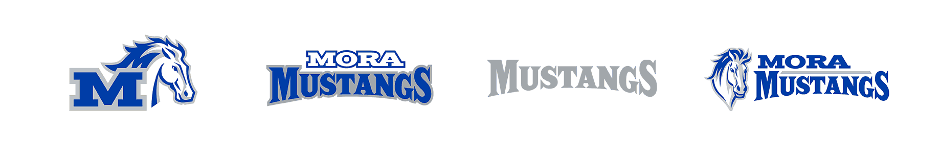
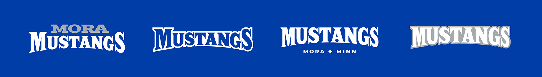
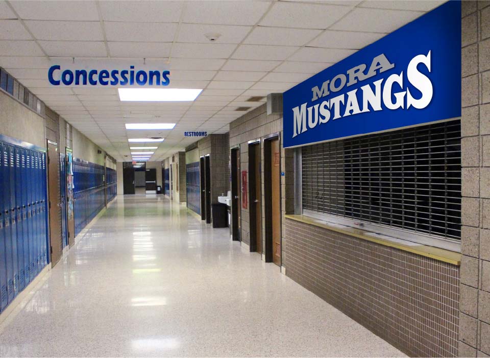
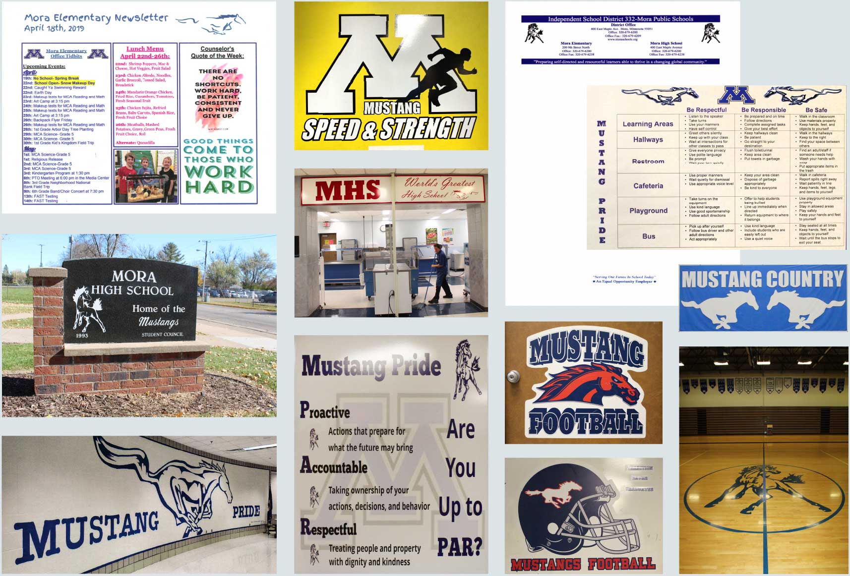
Like many public school districts, Mora Public Schools had always kept its focus on its educational curriculum, teachers, students and families. While important, presenting a strong, unified brand simply didn’t make it to the top of the priorities list. When they had opportunities for Mora Mustangs branding, they met them (signage, uniforms, gym graphics, apparel, etc.). But without official brand elements or guidance, things easily went off the rails.  


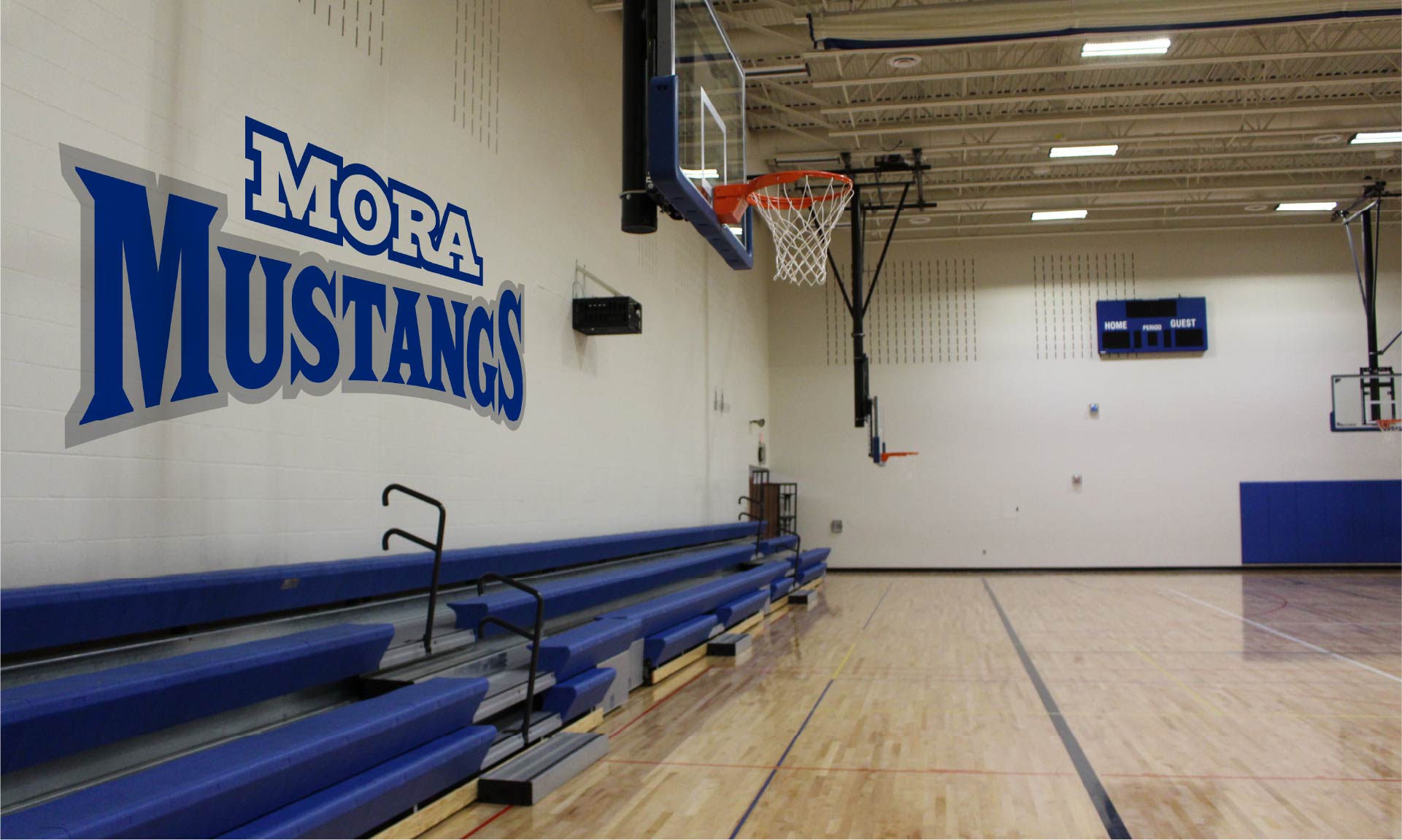
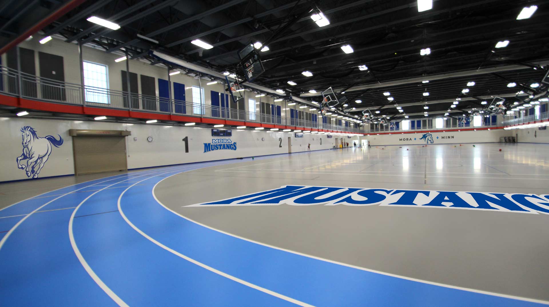
The result? Dozens of different “Mustang” horses/logos and fonts were being used across their district – each in a very different style. The Mustang blue also varied from one item to the next. Essentially, the Mustang brand changed from one sports team and extracurricular activity to the next. Even the communications from the elementary school looked unrelated to that of the high school. Meanwhile, open enrollment options meant that Mora needed to ensure their brand and messaging was strong and clear.


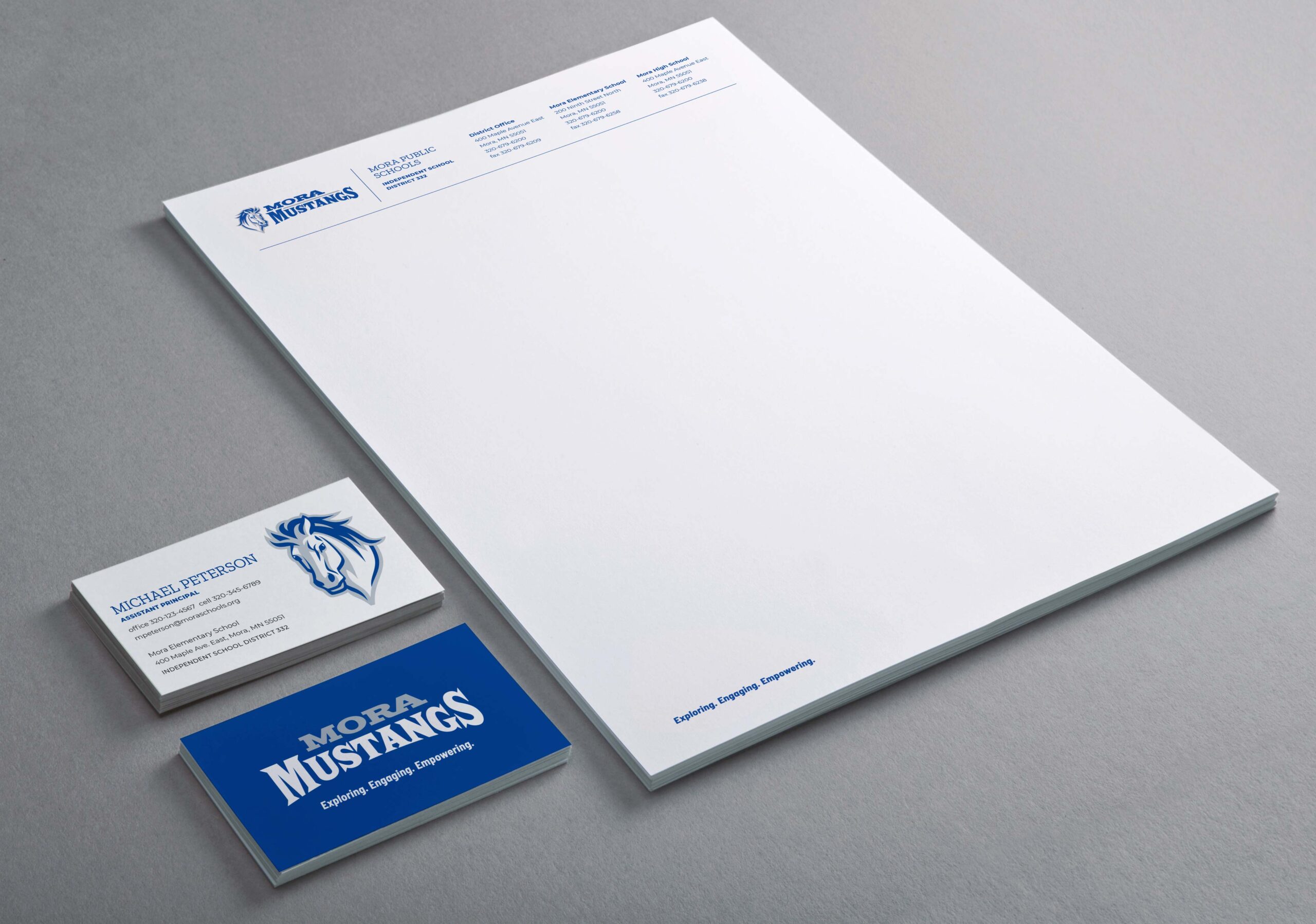
Mora Public Schools selected DRIVE to lead them in unifying and strengthening their brand.

  • Define and align Mora’s values, positioning, personality and messaging to better reflect who they are and what makes them special.
  • Create a unique and ownable visual identity system (Note: The brand audit revealed several of their logos were actually modified versions of other professional and collegiate logos — a HUGE concern.)
  • Ensure all future materials and promotional items remain on-brand by providing brand guidelines and official brand assets to staff and vendors.
  • Discover what makes MPS special — and let it drive us. Our interviews and surveys of MPS students, families, staff and larger Mora community revealed a widespread appreciation of MPS staff’s dedication and engagement with their students. It also revealed an overwhelming amount of Mustang pride from students, staff and alumni alike. Both factors drove the development of the brand.
  • Formally define MPS’s brand personality (strong, proud, caring, committed), and bring it to life through the new logo family and messaging.
  • Craft a tagline that quickly communicates the commitment and passion shared by Mora’s teachers, staff and students.
  • Develop official MPS colors and fonts to be used in any and all MPS marketing and communications.
  • Create an extensive logo family of primary and secondary logos and wordmarks, as well as tertiary “M” marks, MPS can use across their diverse branding needs.
  • Provide staff with with customizable design templates for flyers and postcards, along with brand guidelines to ensure consistency in the future.
  • The new identity is as bold and strong as the beloved American Mustang itself. The new logos, tagline and messaging combine to better reflect Mora Public Schools today, and help set the course for them to continue to strengthen their brand in the years to come.
  • The brand launch focused on immediate marketing/communication needs, as well as uniforms and apparel. Other branded elements, such as building and field signage, continue to be updated as time/budgets permit.

Environmental Branding

“We can confidently say we are now armed with a stronger brand identity that’s well-positioned to present a consistent brand for years to come — not to mention a LOT of Mustang pride.”
EXCERPT FROM "MUSTANGE EXPRESS" ARTICLE ANNOUNCING BRAND LAUNCH

Brand Guidelines

Old Branding

Previously there were over 70 different mustangs being used throughout the school district. There were also inconsistencies in colors, typefaces and messaging — all of which led Mora Public Schools to launch their brand initiative.