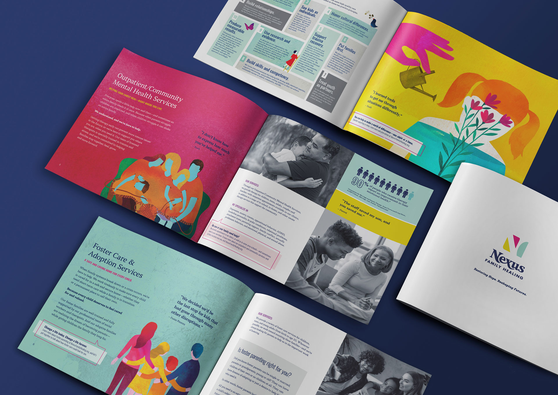
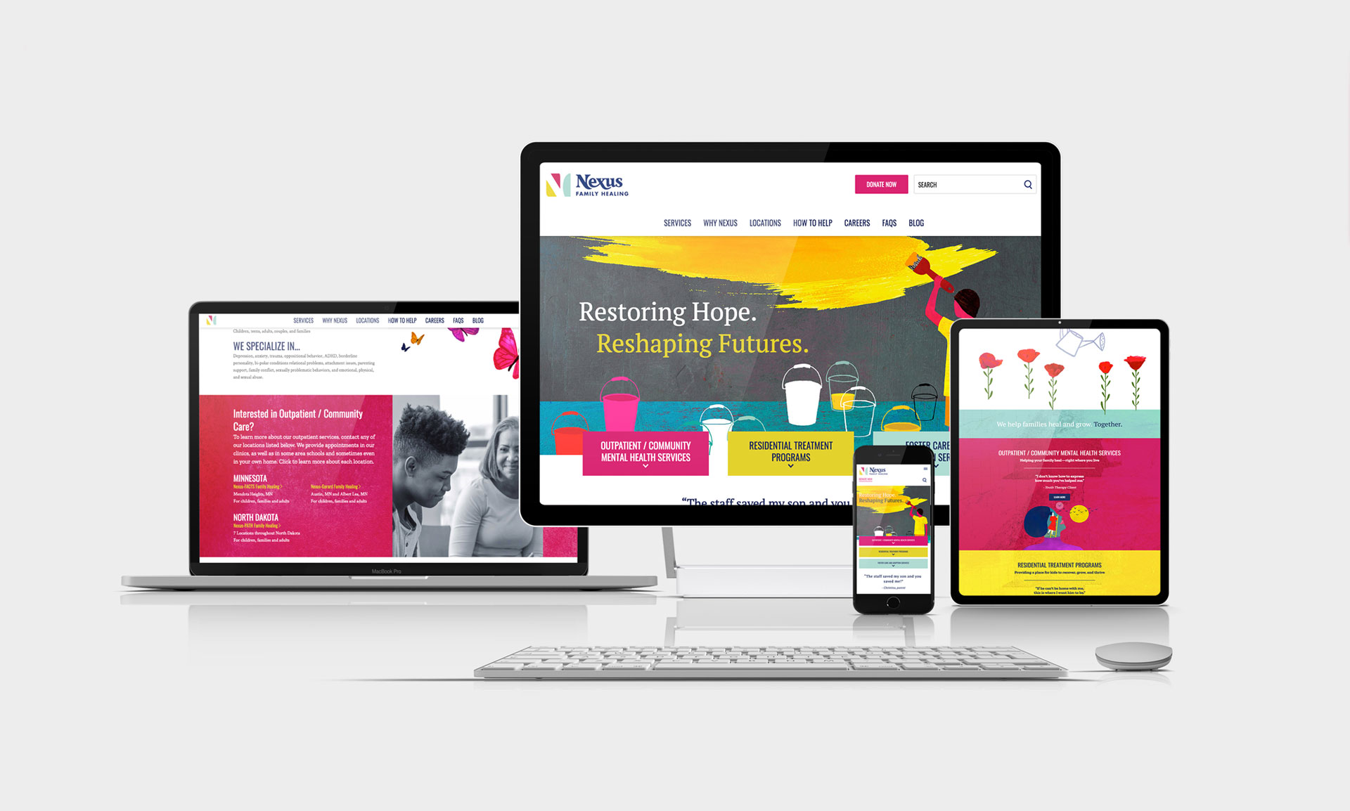
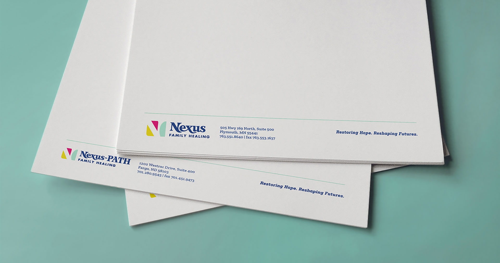
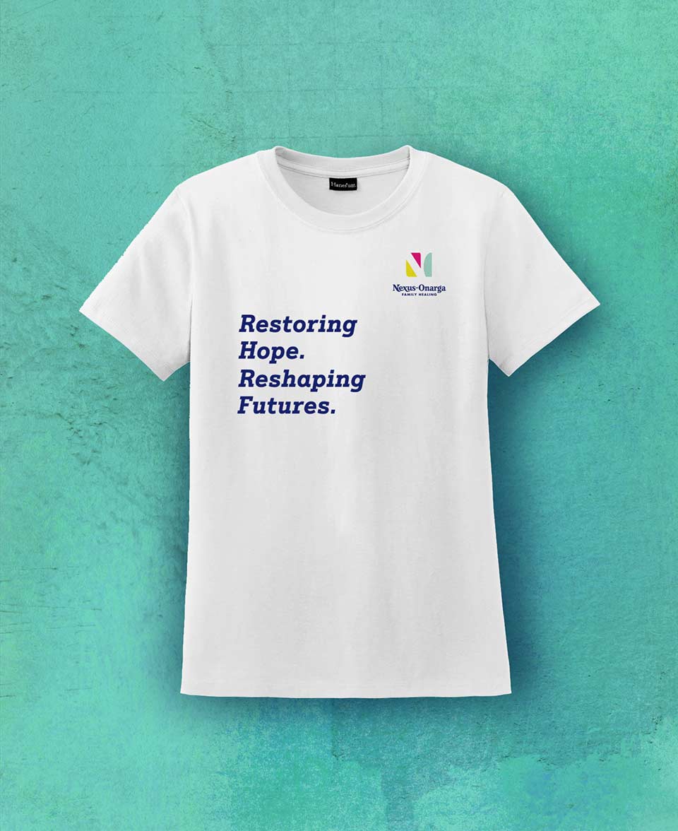
To more clearly reflect their commitment to long-term family stability, we renamed Nexus Family Healing (formerly Nexus Youth & Family Solutions). Their new tagline, “Restoring hope. Reshaping futures.” underscored the outcome of their work. Facility names also changed to better integrate and unify the brand while leveraging their brand equity within their respective communities.
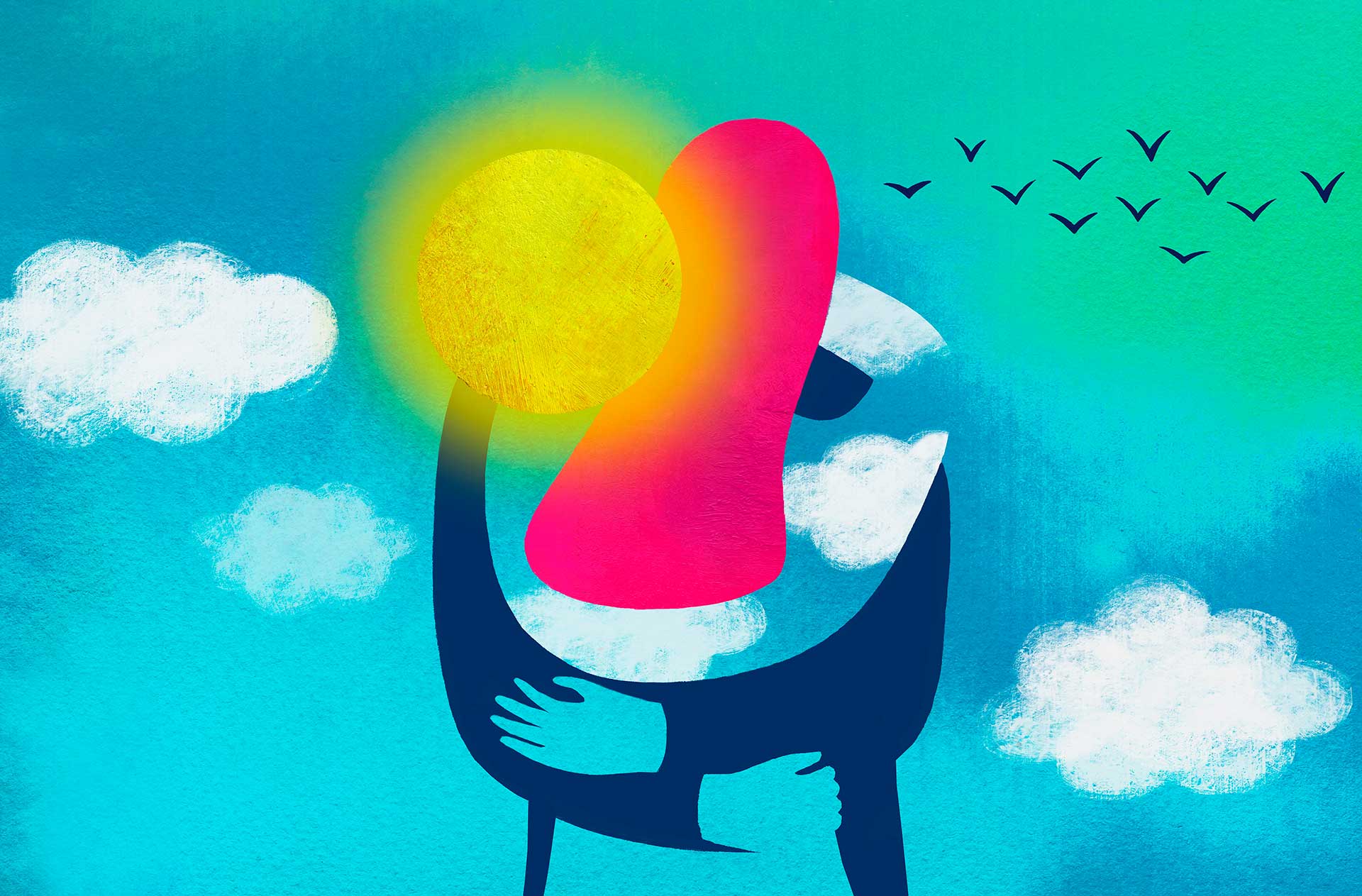
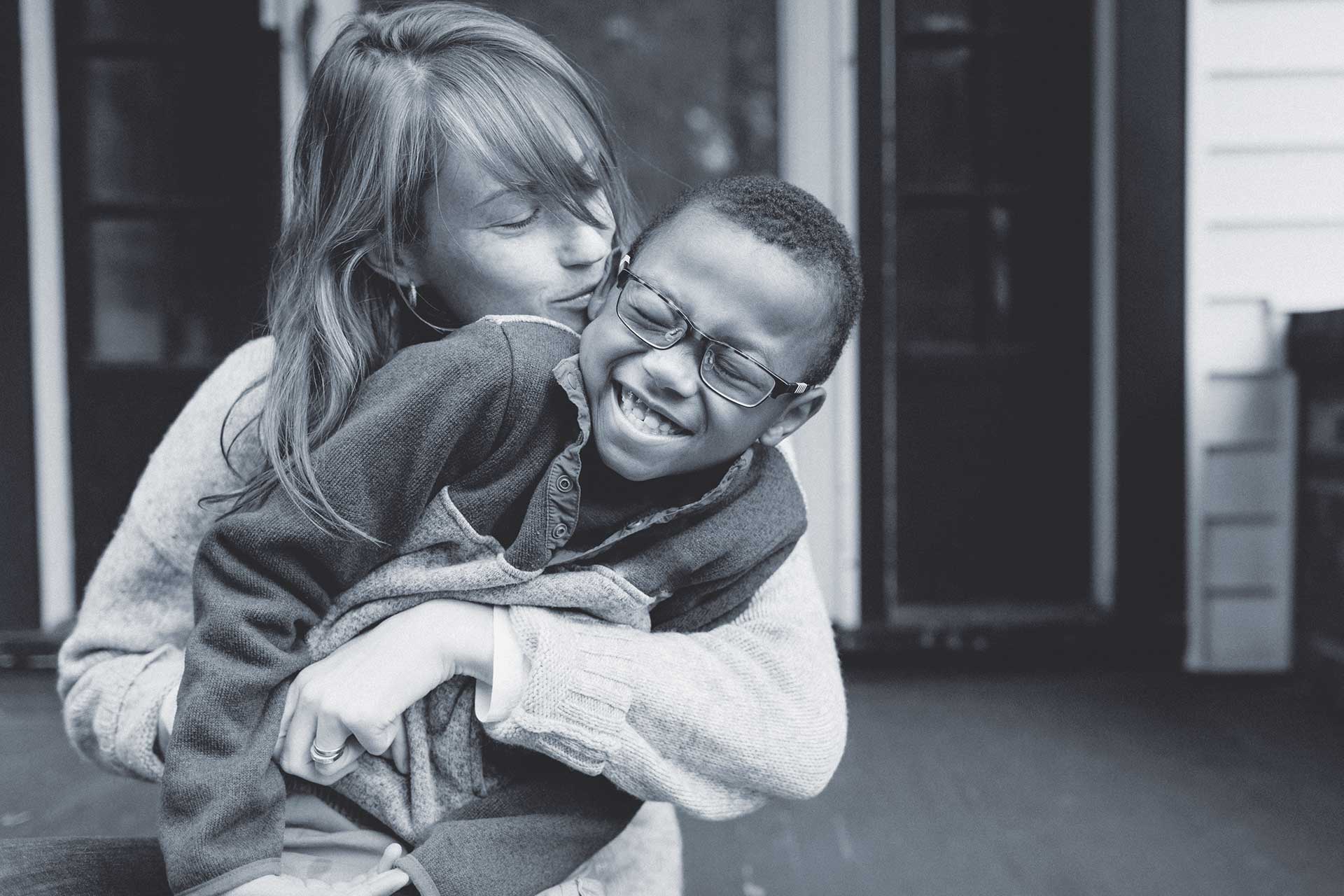
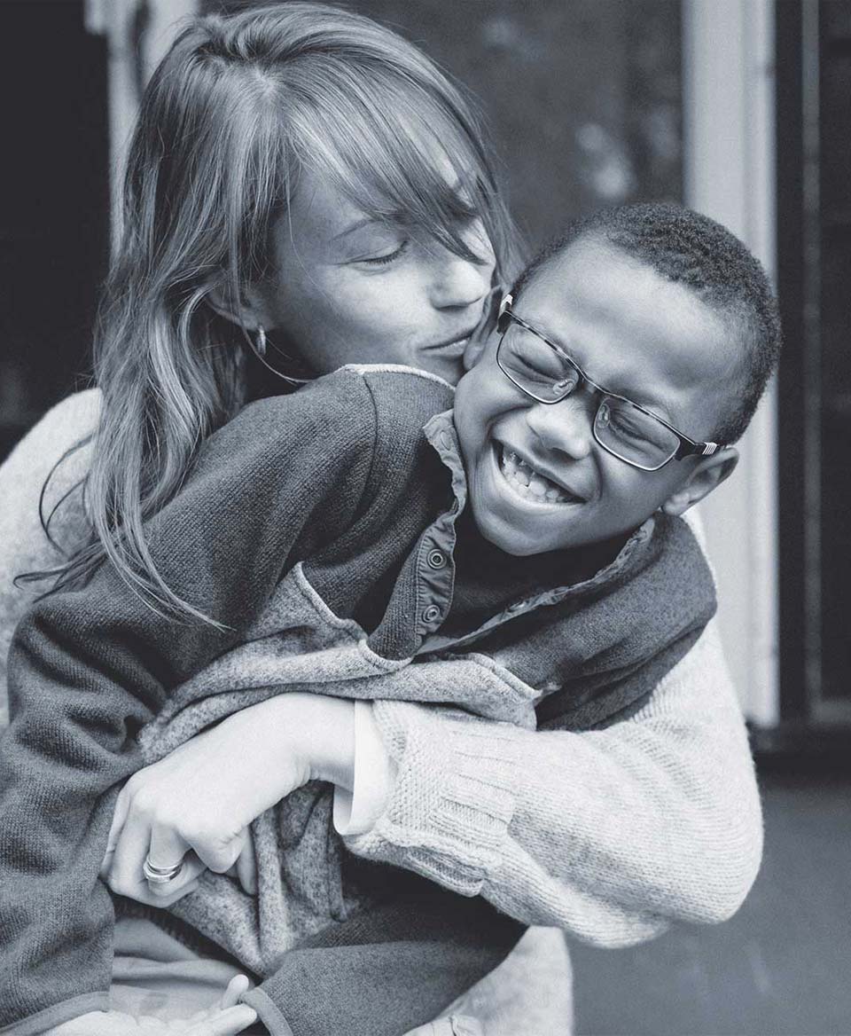
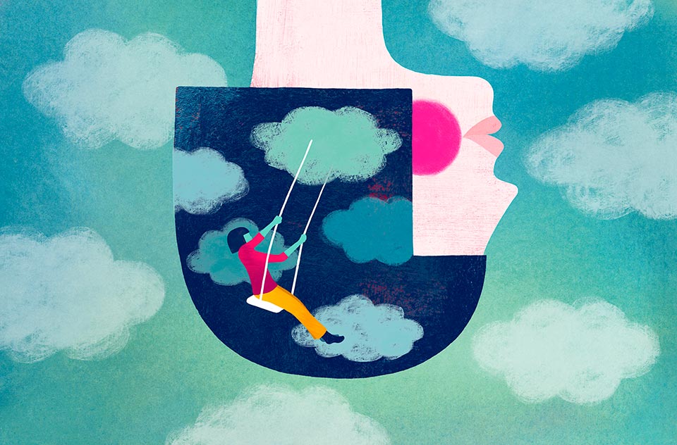
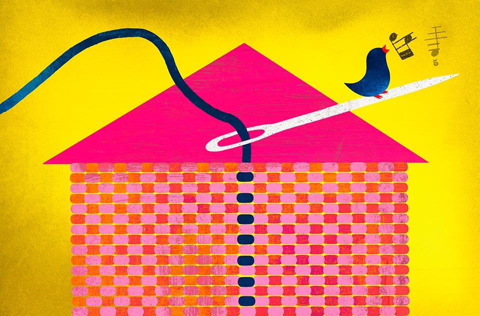
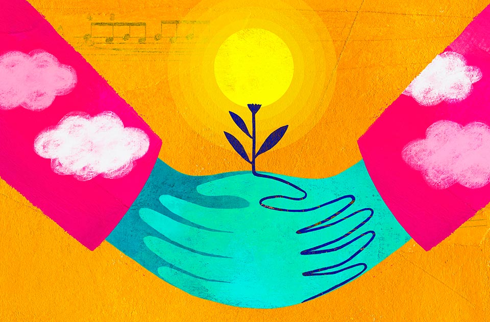
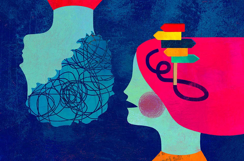
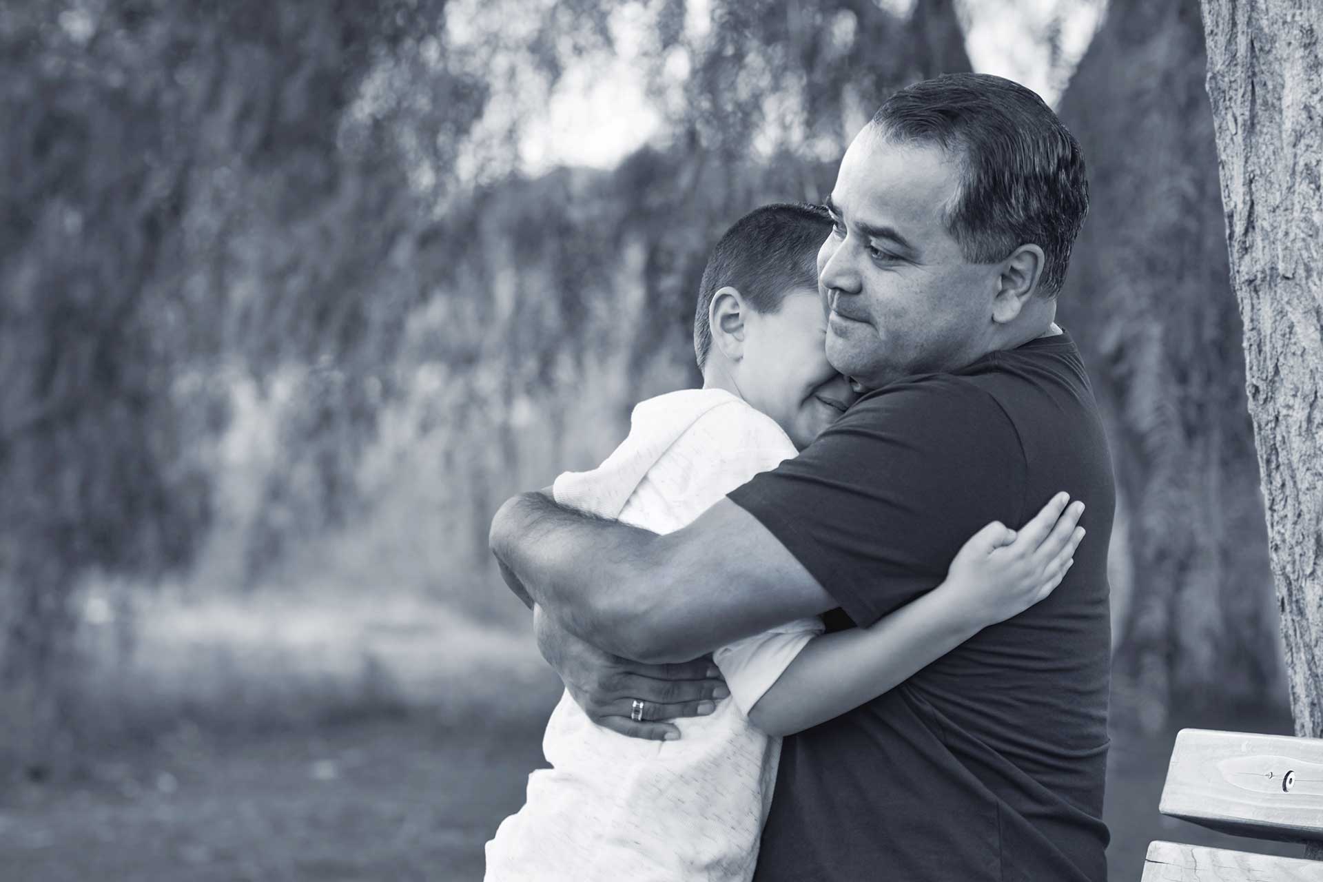
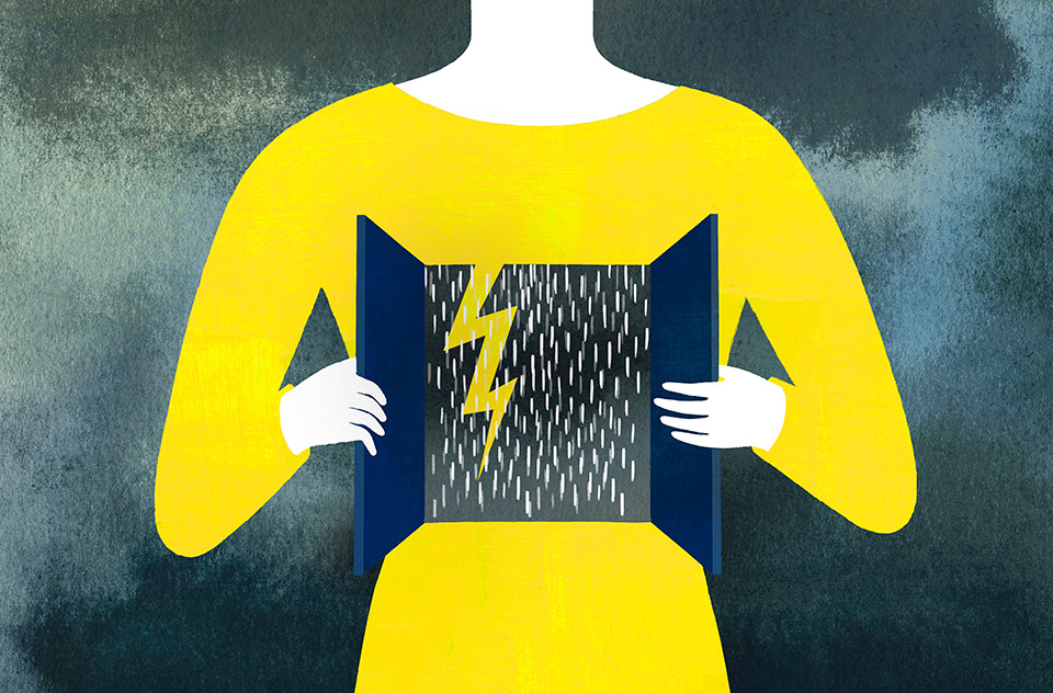
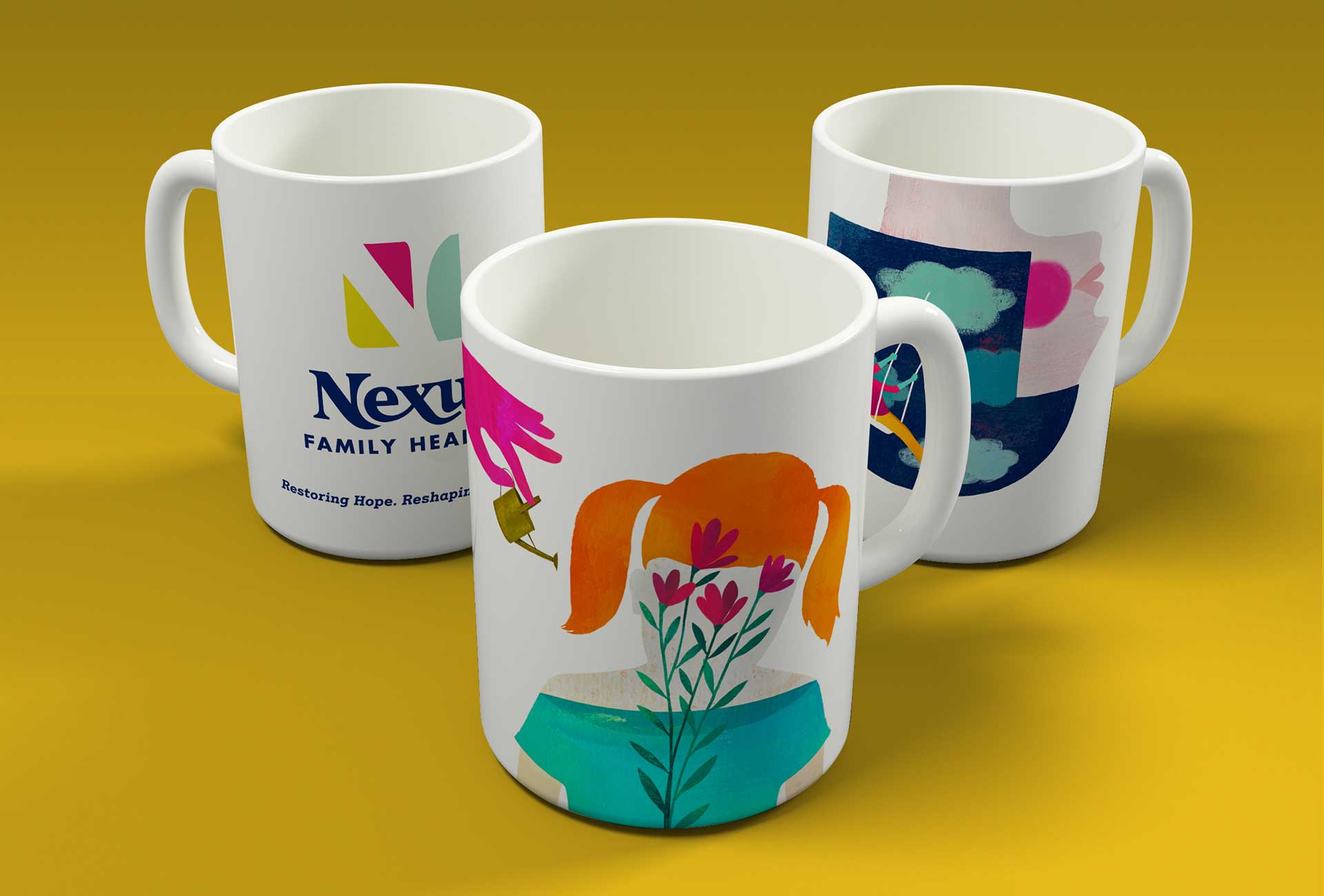
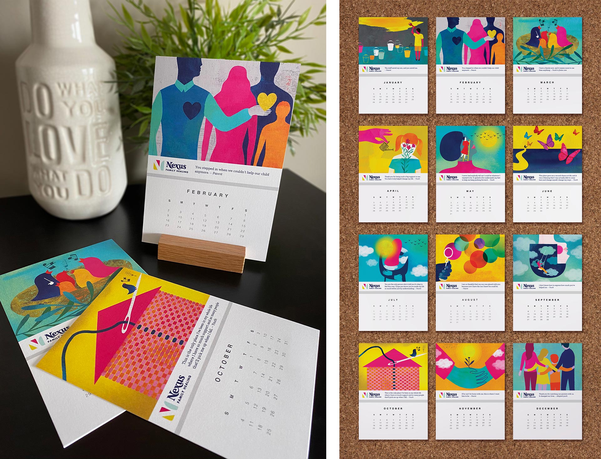
Driven by Nexus’ brand purpose, values and points of difference, we crafted a key messaging framework to guide all internal and external communications. We developed a new visual identity as fresh and progressive as Nexus itself, communicating their expertise at every turn with optimism, compassion and heart. Nexus brand illustrations played an integral role, conveying the emotions of Nexus youth and families in a very universal way. These illustrations speak to the shared human experience, while contributing to the brand’s distinct look and feel.
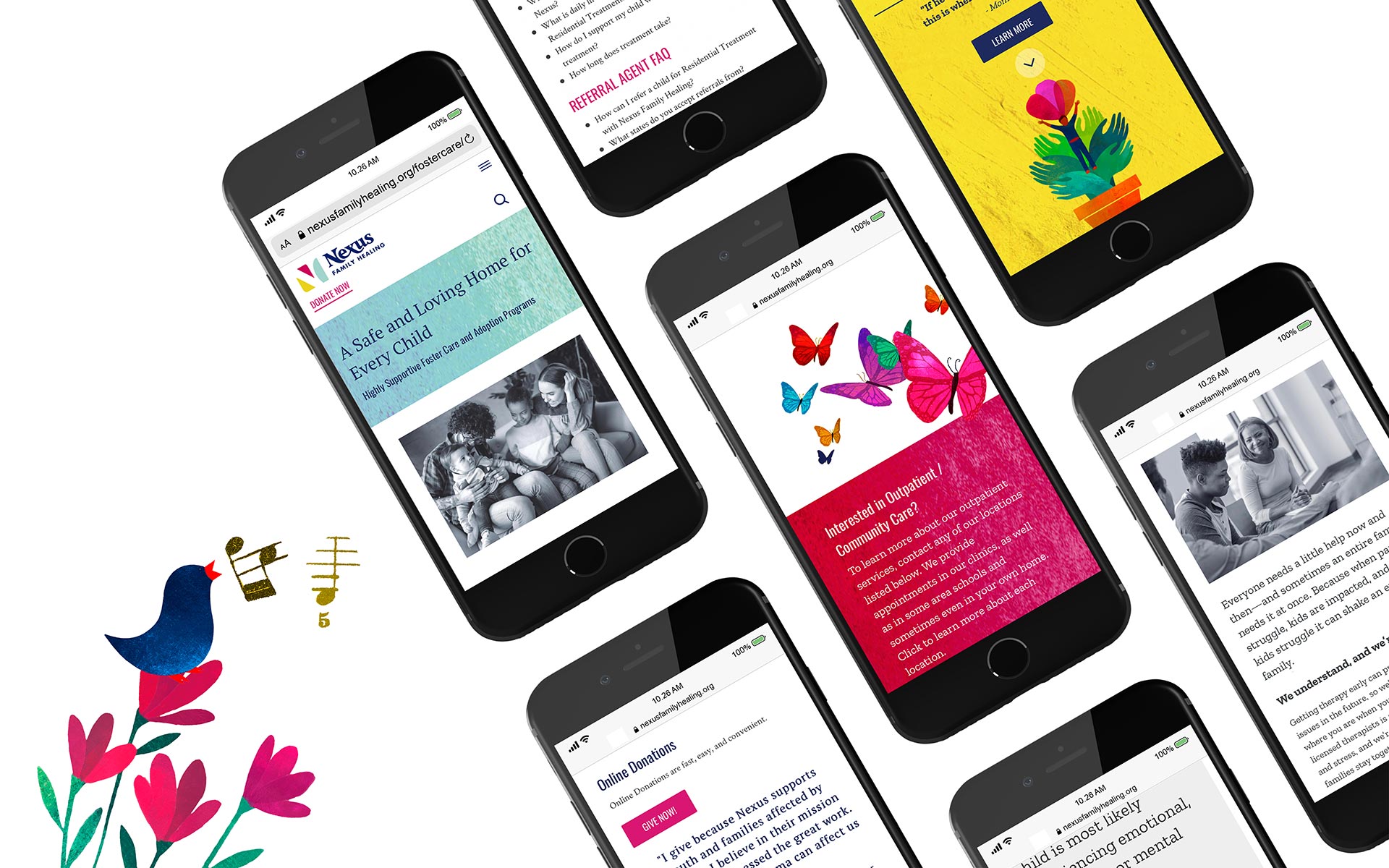
In addition to rolling out all new stationery systems, marketing and signage, we completely rebuilt the web site. Years of content additions across the organization bloated the site to 500+ pages with confusing navigation and lengthy dropdown menus. We completely rebuilt and redesigned the site for better usability, visual impact and storytelling—all powered by a new robust content management system.