Skip to content

Peters Billiards Brand Refresh

Strategy | messaging | VISUAL IDENTITY | CORPORATE MATERIALS + TEMPLATES | SIGNAGE

Repositioning a beloved Twin Cities home entertainment brand

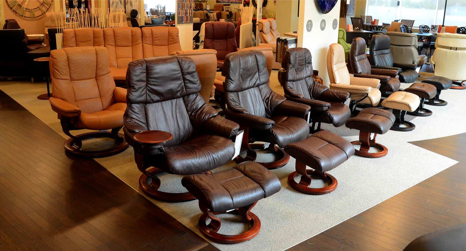
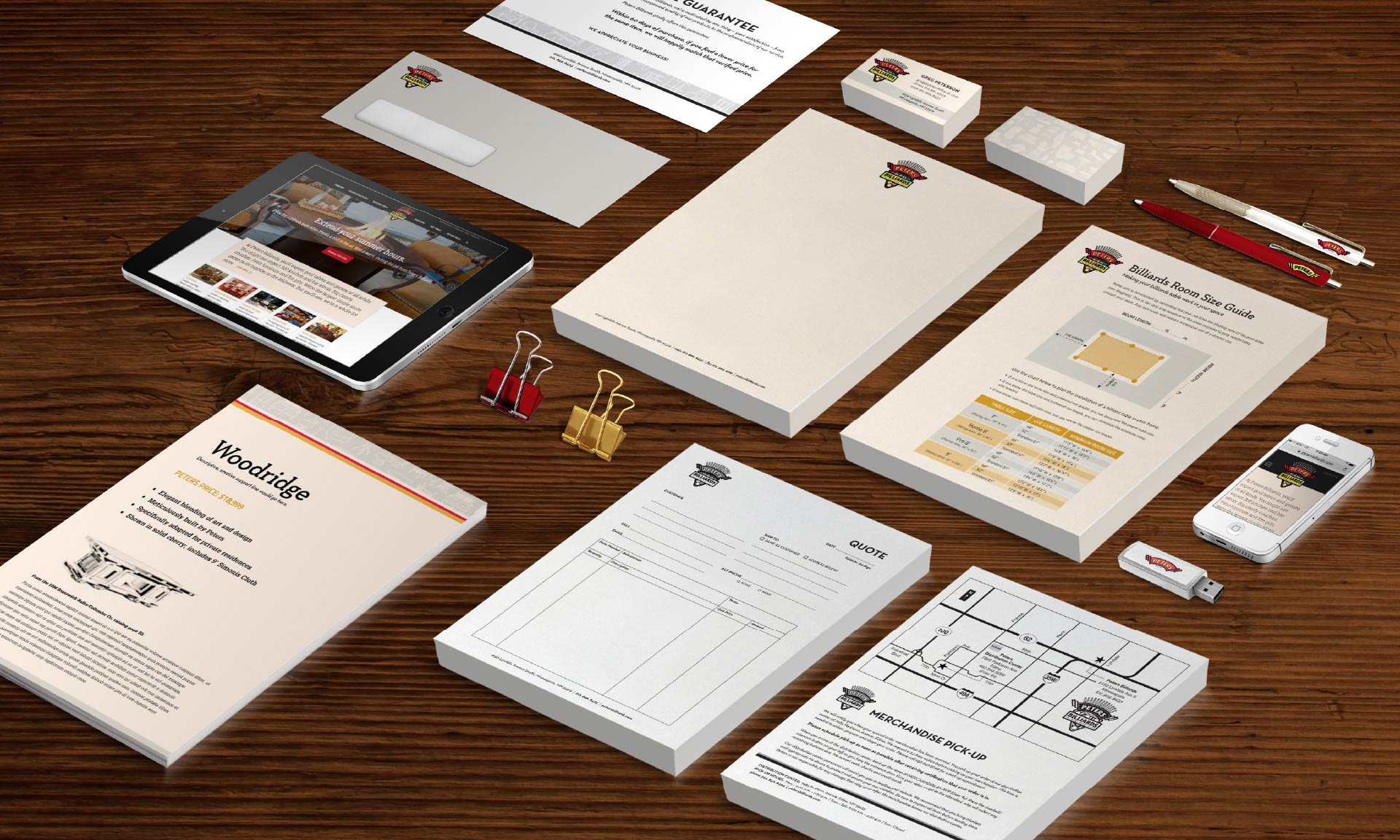
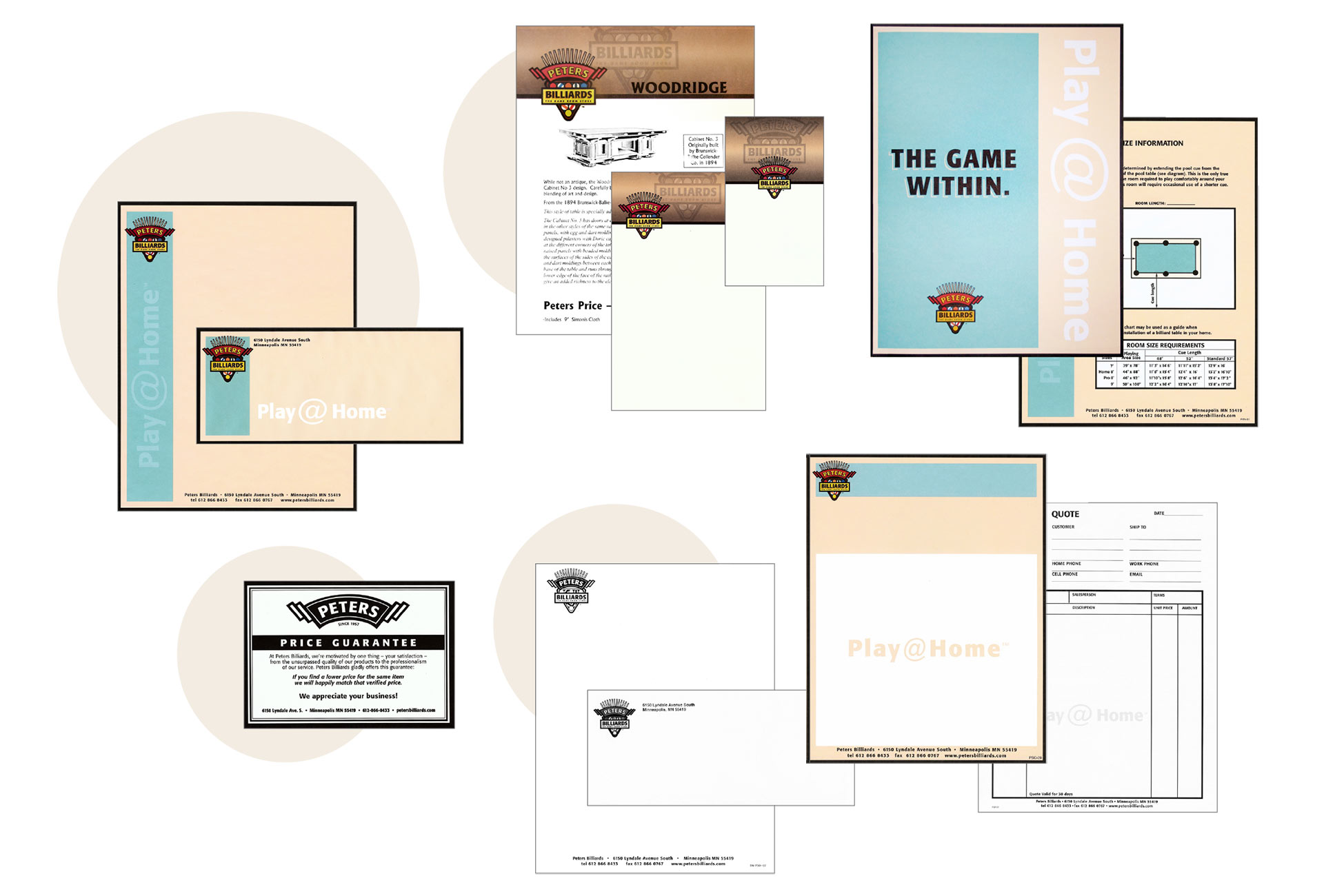
Peters Billiards hadn’t updated their brand in 25+ years, and they’d simply outgrown it. Although their high visibility location and longstanding Twin Cities reputation had helped grow brand awareness, many customers were under the misperception Peters only offered pool tables and gaming equipment. They had a much larger story that wasn’t being told. In partnership with project partner, Beehive Strategic Communications, we were selected to help bring the full Peters story to life.

  • Reposition Peters as a one-stop destination for ALL things that make homes fun, and pull their amazing 300+ bar stool offering, custom-built bars, home theater seating, and high-end patio furniture/decor into the messaging and visuals.
  • Refresh the brand identity to better reflect their high level of quality and craftsmanship and outstanding customer service.
  • Evaluate the effectiveness and usefulness of all existing corporate collateral, sales tools and in-store signage through a customer journey analysis.
  • Peters undeniably had some equity in their iconic logo. While the “Peters Billiards” name and logo were to remain untouched in this refresh, we did modify the logo slightly for a cleaner look, making it easier to read. A secondary logo version was also added that simply extracted the signature “PETERS” banner from the beloved mark.
  • Increasing references to “Peters” (versus “Peters Billiards”) was also key in shifting their positioning to more of an all-encompassing home entertainment destination.
  • To quickly communicate Peters’ extensive selection of indoor/outdoor home furnishings, we created a series of signature Peters patterns. They showcased a wide variety of furniture and home decor, enabling Peters to promote their vast product offerings without even saying a word.
  • A more sophisticated type treatment and refreshed color palette also helped the new identity now match the level of quality customers experienced with their products and best-in-class customer service.
  • In addition, we helped Peters identify cost-saving measures for all marketing and promotional materials. Some items were eliminated. Others were refreshed and/or combined into more effective sales tools.
  • Peters’ marketing team was provided editable design templates for in-store promotional signage, which they successfully rolled out and use on a daily basis.
  • Peters’ marketing manager and sales team were extremely pleased with the brand refresh.
  • Sales associates were proud to hand out business cards and use the refreshed notecards for their personalized customer communications.
  • Staff regularly use the design templates to create in-store promotional signage, ensuring they present a consistent brand image right down to the smallest hang tag.
  • Peters used the new creative assets to refresh their site and social media presence for a consistent brand expression across all customer touch points.
  • The brand refresh, along with a strong messaging strategy, worked in unison to help position Peters as a one-stop destination for getting so much enjoyment out of your home, customers will never want to leave.

Custom patterns quickly communicate Peters' vast product offerings without even saying a word

Old Identity

Peters’ previous identity system was unsophisticated and out of date. The brand audit revealed a disconnect between their marketing materials and in-store signage and the high level of quality, craftsmanship and best-in-class service they proudly provided their customers.