Skip to content

University of Minnesota Extension Rebrand

VISUAL IDENTITY | MARKETING MATERIALS | PUBLICATION DESIGN | DESIGN TEMPLATES

Unifying 40+ brands into one empowers an organization to build a stronger Minnesota

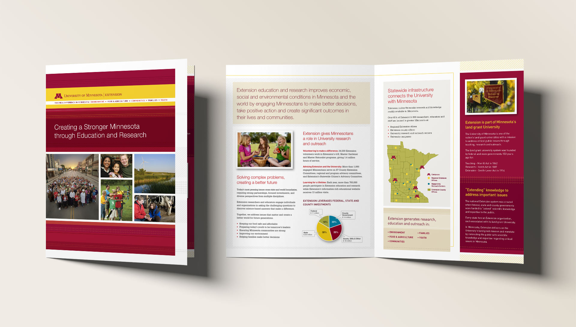
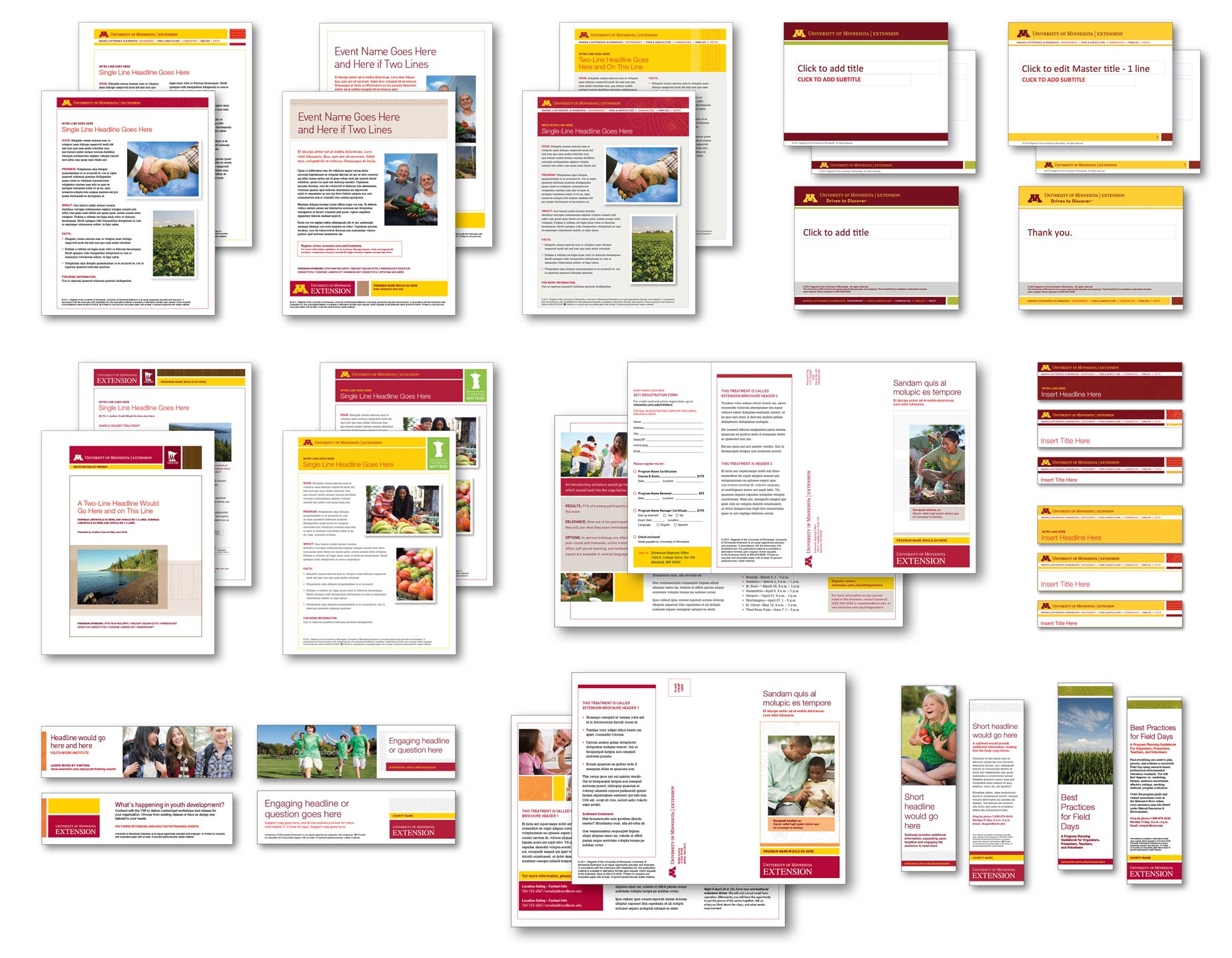
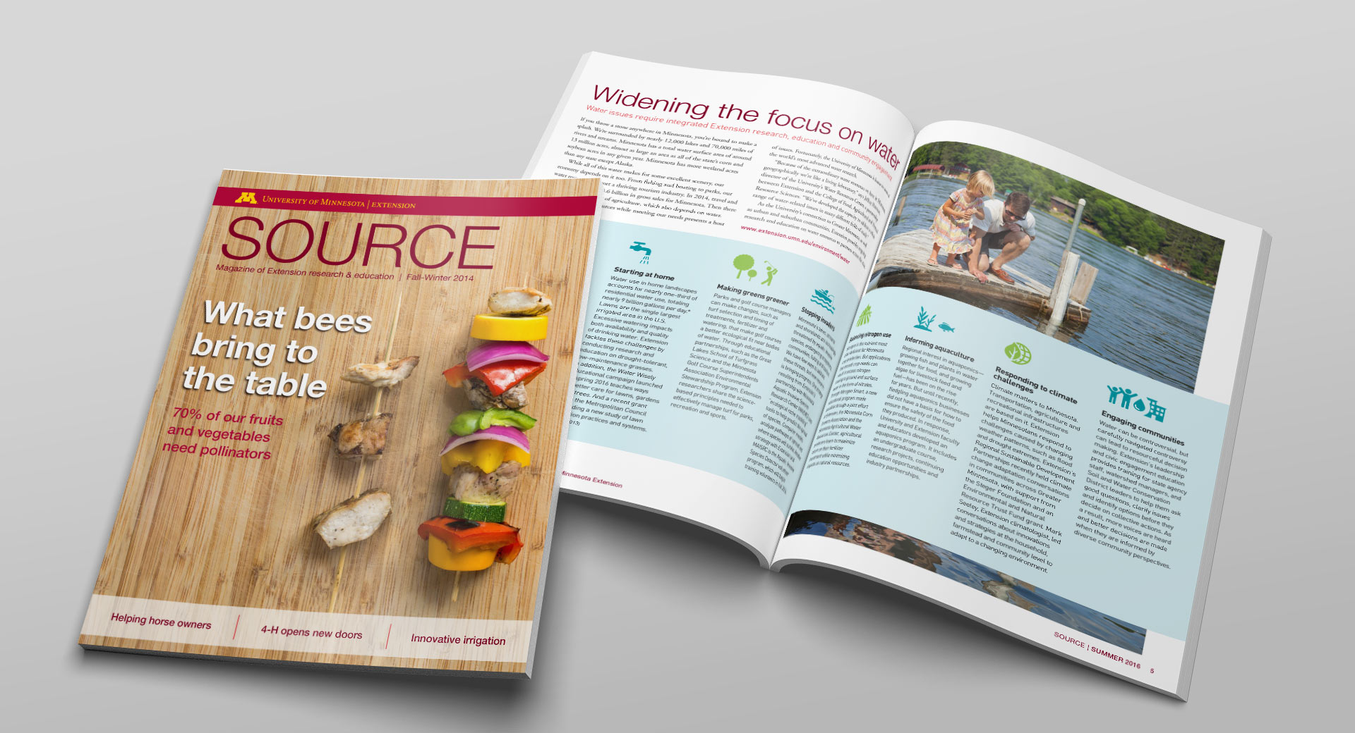
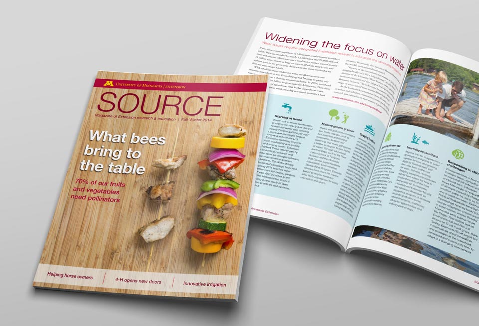
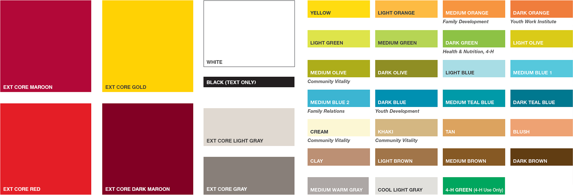
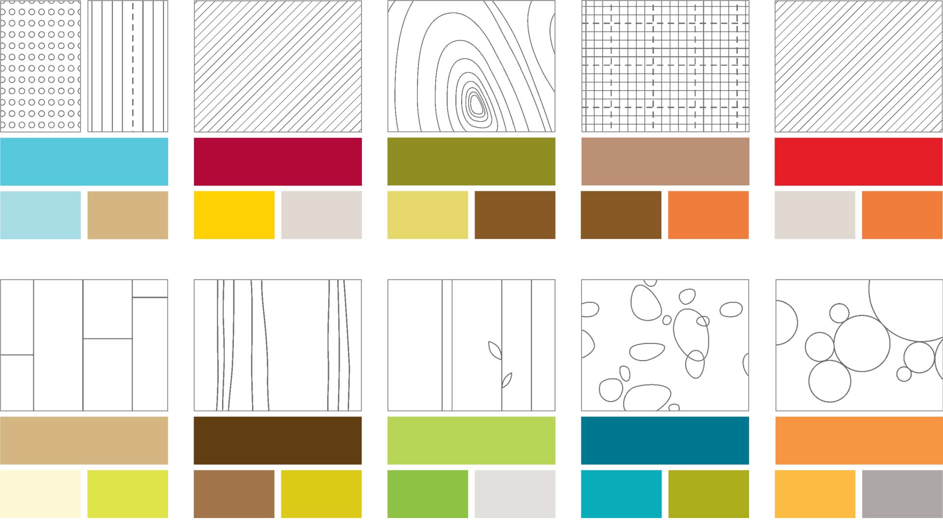
University of Minnesota Extension was on a mission to deliver University science-based knowledge, expertise and training to all Minnesotans. Unfortunately, their efforts were being compromised by a weak brand. They had hundreds of research and education programs with independent visual identities—many failing to consistently identify as a part of UMN Extension. Over time, they’d accumulated over 40 different program logos. To add to the challenge, 75% of their marketing materials were being created by staff with little to no formal design training and spread out across 100+ locations statewide.


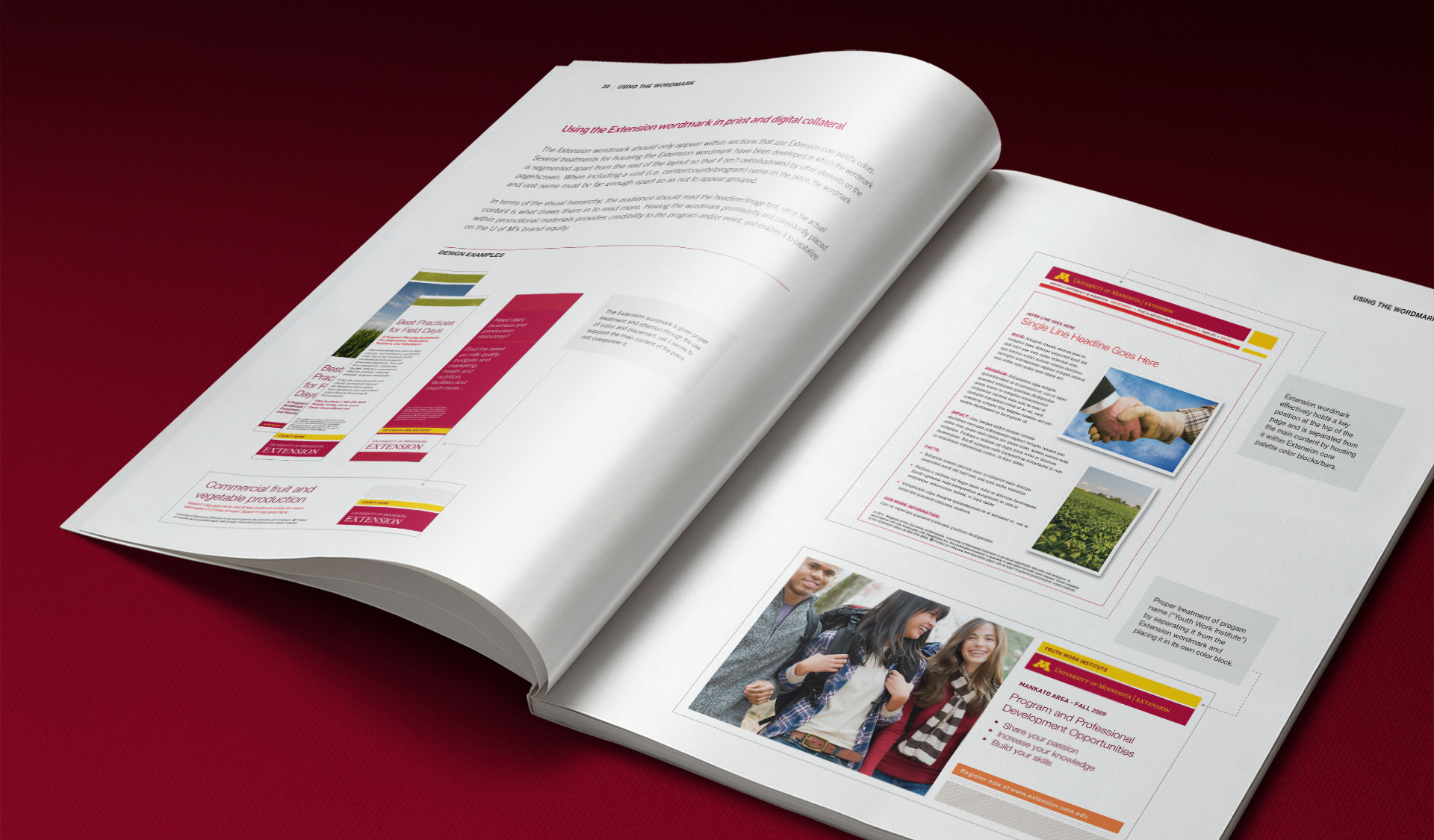
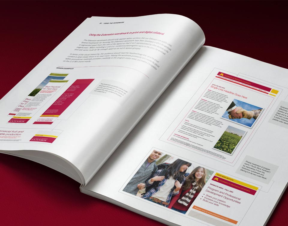
Extension’s diluted branding had led to confusion among their audiences, a deteriorating perception of quality offerings and reduced visibility for the University. This prompted UMN Extension to launch a comprehensive brand initiative, and they selected DRIVE as their partner in this organization‐wide rebranding effort.

  1. Increase brand strength via improved consistency and connection with the larger University

  2. Provide clarity and enhanced visibility for Extension programs

  3. Improve efficiencies and cost effectiveness in producing marketing/communications materials

  • Unify the brand. Extension’s vast range of programs required a visual identity cohesive enough to build brand recognition, yet flexible enough to avoid a boring, repetitive look across all materials.
  • Build flexibility and create opportunities for sub-level branding into the identity system. A primary set of visual elements makes Extension’s brand instantly recognizable, while also connecting to the University. Develop sub-brand identities for centers and select programs, each with their own signature color combinations, accent colors, and additional custom patterns—all in alignment with the UMN Extension brand.
  • Develop brand guidelines not only outlining instructions and providing examples of how to use the identity elements, but also directing Extension program materials to use only the official UMN Extension wordmark. All other logos and taglines were prohibited.
  • Develop tools, templates and resources to make it easy for staff to create high‐quality, consistent marketing communications, including hundreds of design-friendly MS Office templates. UMN Extension also provided staff training to support the use of these new tools and resources.
  • Create an online photo gallery providing staff and Extension’s creative partners with easy‐to‐access, high‐quality, professional photos adhering to the new photo guidelines.
  • All three initiative goals were successfully met.
  • One logo and visual identity system now unites all UMN Extension centers, programs and materials across the state of Minnesota, providing a significant increase in Extension’s brand recognition.
  • Two years into this comprehensive rebrand initiative, a survey revealed over 70% of staff used the design templates for 75-100% of their materials. Over 36% used the templates ALL the time. That number continues to grow.
  • Extension’s brand guidelines, visual assets and growing library of brand-right images continue to empower both in-house and creative partners to express the Extension brand with both brand consistency and visual interest.

Hundreds of staff-friendly design templates

A huge inventory of MS Office templates, tools and resources were developed, making it easy for staff to create high‐quality, consistent marketing communications. UMN Extension also provided staff training to support the use of these new tools and resources.


“University of Minnesota Extension originally hired DRIVE to provide design leadership on our organization’s rebranding project, unifying more than 40 brands into one parent brand—no small endeavor.

In working with Jodi and her team for several years, I continue to be amazed and inspired by the way they finesse the soft skills required to bring a brand to life, including an outstanding ability to influence through research and visual thinking. I truly count myself lucky to be working with them.”
Sarah Bjorkman | FORMER public/internal relations consultant & brand manager
University of Minnesota Extension

Brand Guidelines

The new system includes sub-level branding for centers and select programs. Each has its own signature color combination, accent colors, and custom patterns—all in alignment with the UMN Extension parent brand. 

Old Identity

Over 40 unrelated program logos, little to no consistent UMN Extension branding, the use of low quality graphics and poorly designed materials all contributed to a confusing, diluted brand.